A brochure with a logo that has a soft drop shadow. It looks right on screen, right in the preview, right on your office printer. The print shop sends back a proof with a solid black rectangle where the logo should be.
The image is not corrupt. It is transparent, and something in the print path could not cope with that.
PDF gained transparency late
For its first several years, PDF had no transparency at all. Objects were opaque: you drew one thing, then another on top, and the second hid the first. Transparency arrived with PDF 1.4 in 2001, and it arrived as a substantial addition — transparency groups, blend modes, and soft masks.
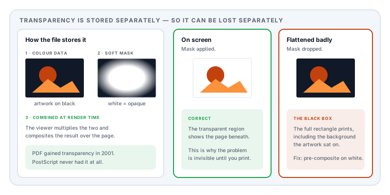
A soft mask is the mechanism that matters here. When you place a PNG with an alpha channel into a PDF, the colour data and the transparency data are stored separately: the image itself, and a greyscale mask stating how opaque each pixel is. The renderer combines them at display time.
The complication is what happens further down the chain. The printing model PDF grew out of — PostScript — has no transparency model whatsoever. Every object is opaque. So any print path that goes through PostScript, or through a raster image processor built on those assumptions, cannot simply pass transparent artwork along. It has to be converted first.
Flattening, and how it fails
That conversion is called flattening. The renderer works out what the transparent artwork actually looks like once composited, and produces equivalent opaque artwork — cutting shapes into pieces where they overlap, and rasterising regions that cannot be expressed any other way.
Done properly it is invisible. It goes wrong in a few characteristic ways:
The soft mask is ignored. The renderer draws the image and skips the mask, so a logo whose visible shape was defined entirely by transparency renders as its full rectangular extent — including the background colour behind the artwork, which in exported artwork is very often black.
A blend mode is unsupported. Multiply, Screen and similar modes have no opaque equivalent in isolation. A renderer that does not implement them may substitute Normal, and a layer intended to darken becomes a solid block.
Overprint is misread. Overprint settings tell a press to lay one ink over another rather than knocking it out. Misinterpreted, they produce dark or missing areas.
Colour space confusion. Artwork built in RGB with transparency, converted to CMYK during flattening, can shift dramatically at the edges of the transparent region — producing dark banding rather than a clean box.
Diagnosing it in two minutes
Does it look right on screen and wrong on paper? Then the file is fine and the print path is the problem. Nothing you do to the layout will help.
Does another printer produce it correctly? Then it is specific to one driver or RIP, and the practical fix is to pre-flatten rather than to argue with the device.
Does the affected artwork have a shadow, a glow, a fade, or a transparent background? That confirms the diagnosis. Vector shapes and plain opaque photographs are almost never affected.
Try “print as image” once, as a diagnostic rather than a solution. If the black box disappears, transparency handling was the cause.
Fixing it
In rough order of preference:
Pre-composite the image. Open the artwork, place it on a white background, flatten it there, and export a version with no transparency at all. Then place that in the document. Inelegant and completely reliable.
Export with transparency flattened. Most authoring tools offer this at export time, and doing it in the application that owns the artwork gives a better result than leaving it to an unknown RIP.
Export to PDF/X-1a if the destination is a commercial press. That profile does not permit live transparency, so conforming output has already been flattened — which is precisely why print workflows standardised on it. PDF/X-4 does permit transparency, and is the right choice only when you know the RIP supports it.
Avoid blend modes in print artwork unless you have confirmed the destination handles them.
Rasterise the page as a last resort. It solves the problem and costs sharpness — see why a PDF prints blurry for what that trade actually costs.
If you are sending to a print shop
Ask them what they want, before you build the file. Most have a specification, and most of the specification exists because of the failures described here. The two questions worth asking are which PDF/X profile they want and whether their workflow supports live transparency.
A five-minute conversation before design starts is cheaper than a proof round, and considerably cheaper than a print run.
Sources and further reading
- ISO 32000-2:2017, the PDF 2.0 specification — the transparency model: transparency groups, soft masks, blend modes, and the alpha compositing formula.
- ISO 15930-1, PDF/X-1a — the print-production profile that prohibits live transparency, requiring flattening before delivery.
- ISO 15930-8, PDF/X-4 — the later profile that permits live transparency where the workflow supports it.
- ISO 15076-1, ICC colour management — the colour architecture behind the RGB-to-CMYK shifts that accompany flattening.