The entire premise of PDF is that a document looks the same everywhere. That is the reason it exists, and the reason institutions insist on it: unlike a word processor file, a PDF is supposed to carry its own appearance with it.
Most of the time it works. When it does not — when your carefully laid-out CV arrives at a recruiter with the headings in the wrong typeface and the second page nearly empty — the cause is almost always the same one thing.
A PDF does not always contain its own fonts
A PDF describes text by naming a font and giving character codes and positions. What it does not necessarily include is the font itself.
There are two possibilities for every font in a document:
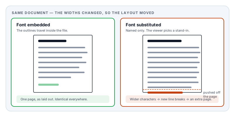
Embedded. The actual font program — the outlines of every letter — is stored inside the PDF. Any viewer, anywhere, draws the text using precisely the shapes the author saw. This is what you want.
Referenced by name only. The file says “this text is in Calibri” and leaves it there. The viewer must find Calibri on the machine it is running on. If it is installed, the text looks right. If it is not, the viewer picks something else.
That second case is where documents go wrong, and it is invisible to the person who created the file — because they have the font installed, so their copy looks perfect.
Why substitution does more damage than you would expect
If a viewer simply drew your text in a different but similar typeface, the result would be mildly ugly and perfectly readable. The real damage is geometric.
Every font assigns each character a width. Those widths differ between typefaces — a lowercase a in one font is not the same width as in another. When a viewer substitutes, the widths change, and the text no longer occupies the space the author laid out.
The consequences cascade:
- Line breaks move. A line that just fitted now wraps early, pushing a word to the next line, and every line after it shifts.
- Text overflows its box. Headings collide with body text; captions run past the edge of an image.
- Tables misalign. Column contents that were positioned to line up no longer do.
- The page count changes. Small per-line differences accumulate down a page, and a two-page document becomes three with one orphaned line on the last.
- Justified text develops rivers. Word spacing was calculated for the original widths.
This is why font problems present as layout problems. People describe the symptom as “my formatting broke on their computer” and look for a formatting cause, when the actual cause is a missing typeface.
Good viewers mitigate it by choosing metrically compatible substitutes — replacements deliberately designed to have identical character widths. There are well-known pairs: Arial and Helvetica, and the Liberation family designed as width-matched substitutes for the common Microsoft fonts. When a metric-compatible substitute is available the layout survives even though the letterforms change. When one is not, the layout moves.
Why phones are worse
A desktop operating system ships with dozens to hundreds of fonts. A phone ships with a handful.
So a viewer on a phone attempting substitution has a much smaller pool to choose from and is far more likely to fall back to a generic default that is nothing like the original. A document that looks acceptable on two different laptops can still fall apart on a tablet — which matters, because a growing share of documents are first opened on a phone.
The historical exception that still causes trouble
For most of PDF’s life, the format assumed that every reader had a set of 14 standard fonts available — the Helvetica, Times, Courier, Symbol and ZapfDingbats families. A document could use these without embedding anything, and it was expected to work.
That assumption was reasonable in 1993 and is not now. Many modern systems, especially mobile ones, do not have those exact fonts at all and substitute for them like any other. PDF 2.0 removed the special status of the standard 14 accordingly.
The practical consequence: a document that relies on “just use Helvetica” is not safe, even though it was for decades, and even though the software that made it may not warn you.
Subsetting is fine — and worth understanding
Most embedded fonts are subsetted: only the characters actually used in the document are included. A document using 60 distinct characters carries 60 glyph outlines rather than a full font of several thousand.
This is good practice and it is why embedding does not usually bloat a file. You can spot it in a fonts list — subsetted fonts are conventionally given a six-letter prefix and a plus sign, like ABCDEF+Calibri.
The one thing to know is that subsetting is a one-way door for editing. If someone later needs to change 2024 to 2025 and the digit 5 was never used in the document, the glyph simply is not there. This is a common cause of “why can’t this PDF be edited properly”, and it is not a limitation of the editing software — the shape does not exist in the file.
When fonts are not the culprit
Fonts explain the large majority of cross-device differences, but not all. Worth ruling out:
Form fields that render blank elsewhere — a different mechanism entirely, covered in my filled PDF form came back blank.
Transparency and blend modes. Drop shadows, overlapping translucent shapes, and certain blend effects are handled differently between rendering engines, and can appear as banding or unexpected boxes.
Colour management. Colours can shift between screens when a document carries an ICC profile that one viewer honours and another ignores. This is the main reason a print proof looks different from the screen.
Annotations. Comments, highlights, and stamps are drawn by the viewer rather than being part of the page, and their appearance genuinely varies between applications.
How to check, and how to fix it
To check: open the document properties in any desktop reader and look at the fonts list. Every font used will be listed with its type and whether it is embedded. Anything without an embedding note is being supplied by the reader, and will substitute on a machine that lacks it.
To fix, in order of preference:
- Re-export with font embedding enabled. Nearly every application that produces PDFs has this setting, and it is sometimes off by default for file-size reasons. This is the correct fix.
- Export to PDF/A. The archival standard requires all fonts to be embedded, so conforming output cannot have this problem by construction.
- Convert text to outlines. This turns letters into vector shapes, so no font is needed. It guarantees appearance — and destroys the text layer, so the document can no longer be searched, copied, or read aloud by a screen reader, and it usually gets bigger. Reserve this for artwork going to a print shop.
For anything heading to a printer, embedding is not optional. Commercial print workflows have their own ISO standard, PDF/X, which exists largely to require it — a substituted font discovered after a print run is an expensive discovery.
Where Lemmafour fits
Markdown to PDF embeds the fonts it uses into every document it produces. There is no configuration for it and no way to accidentally turn it off, because a document that renders differently on the recipient’s machine is not a document that did its job.
That output is generated in your browser, so the file lands on your disk without a round trip through a server — which for a CV, a contract, or an application letter is worth having.
Sources and further reading
- ISO 32000-2:2017, the PDF 2.0 specification — defines font dictionaries, embedded font file streams, glyph widths, and removes the guaranteed availability of the standard 14 fonts.
- ISO 32000-1:2008 — the earlier edition, which documents the standard 14 fonts and the substitution behaviour expected when a font is not embedded.
- ISO 19005-2, PDF/A-2 — the archiving standard, which makes font embedding mandatory.
- ISO 15930-8, PDF/X-4 — the print-production standard, which likewise requires embedding and adds colour-management requirements.
- The OpenType specification — the font format underlying most embedded PDF fonts, including the width metrics whose differences cause reflow.