A wide table fails when it is treated as ordinary prose: either the columns overlap, text becomes too small to read, or values are clipped beyond the page. The correct response is not one universal scale factor. It is a sequence of layout decisions that preserves meaning.
Lemmafour first evaluates the table’s semantic shape and available region. It can keep a modest table in the current column, promote it to the full text width, place it on a dedicated page, use landscape orientation, or divide a very wide notebook table into labeled column bands. Manual placement remains available because only the author knows which comparisons must stay side by side.
Start with a semantic table
A Markdown header row or an HTML notebook table with real <th> cells tells the engine which labels identify columns and rows. Captions state what the table measures; a summary can explain the reading direction for complex tables.
:::table{#tbl:metrics caption="Validation metrics" summary="Rows are checkpoints; columns report quality and resource measures." layout=auto}
| Checkpoint | Loss | Accuracy | Latency | Memory |
| :--- | ---: | ---: | ---: | ---: |
| Epoch 12 | 0.31 | 87% | 31 ms | 860 MB |
:::
Repeated headers on continuation pages are useful only when the source identifies a header. A table without one may still render, but the project health panel should ask for review rather than inventing semantics.
When the table has too many columns
For a saved notebook table with many output columns, fitting every value into one portrait row can make the result unusable. Lemmafour can partition the columns into part 1 of N, part 2 of N, and so on. Each part repeats the row key, such as Checkpoint, Property ID, or Experiment, so the reader can associate values across bands.
The repeated key is deliberate. Repeating a synthetic pandas index such as 0, 1, 2 is less useful when a real identifier is present, so the notebook projector prefers the first real key beside that index. Every non-key field appears in one band; it is not duplicated or omitted.
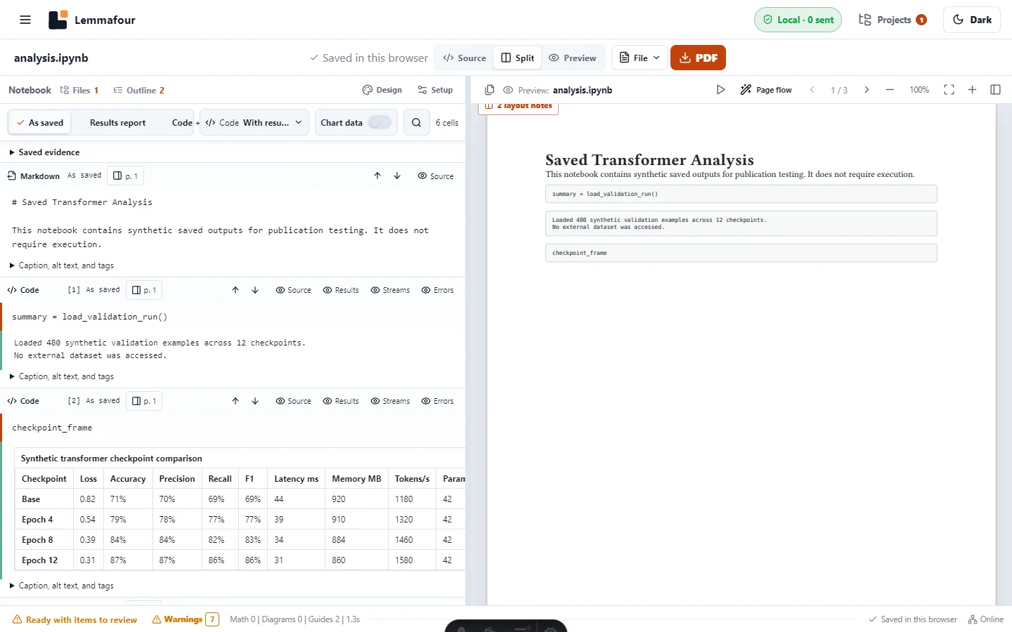
The tested notebook PDF demonstrates a 14-column table, saved SVG output, and a Vega-Lite chart without running Python.
Choose placement according to the reading task
Current column is appropriate for short comparison tables whose cells remain readable at the surrounding text width.
Page width lets an object span the normal text area. In a two- or three-column document this is often the best first promotion because it retains portrait reading and nearby context.
Dedicated page gives a large table or figure a portrait page of its own. Use it when the object needs height as well as width, not merely because it is visually important.
Landscape page is the final width expansion for tables where simultaneous cross-column comparison matters. It should not be the automatic destination for every table: rotated pages interrupt reading and can be awkward on phones and when printed.
The layout=auto instruction asks the planner to choose the smallest readable region. Change the table’s Placement in PDF control when the domain requires a particular result. The control writes a structured choice rather than a fragile visual offset.
Size images independently from table placement
Notebook and Markdown figures offer a document default plus Small (50%), Medium (70%), Large (85%), full placement width, and a custom percentage. The percentage is relative to the current placement. In a two-column region, 70% means 70% of one column unless the figure is promoted to page width.
Use the smallest size that keeps labels readable. Do not shrink a dense chart solely to hold it on the previous page; a clean page break is better than illegible evidence.
Page-flow compaction is intentionally optional
Page flow looks for cases where a bounded image reduction can avoid an otherwise unnecessary page break. It does not run by default, and it does not globally tighten typography. The feature reports opportunities first; applying a suggestion records a reversible image-size override.
This distinction matters. Good typesetting needs paragraph rhythm, space before headings, separation around code and tables, and room for captions. Removing those spaces may reduce page count, but it produces a worse document. Page-flow compaction targets only a specific avoidable break.
Review before export
- Check that headers and the row key are correct.
- Add a caption and, for a complex table, a reading summary.
- Inspect every labeled table band and confirm the key repeats.
- Confirm no field disappears between parts.
- Review chart and image alternative text.
- Use page-width, dedicated, or landscape placement only where it improves reading.
- Export and inspect the final PDF at normal size, not only a zoomed-out overview.
For accessible delivery, continue with how to make a PDF a screen reader can actually read. For physical output, check how to prepare a PDF for printing.